|
|
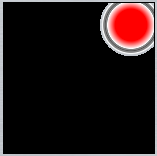
radial-gradient(closest-corner circle at 85% 15%, red, red 50%, white 74%, grey 76%, grey 79%, rgba(80,80,80,1) 81%, grey 83%, grey 86%, white 89%, transparent, transparent 98%, black 98%, black 99%, black
|
|
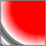
radial-gradient(closest-side circle at 85% 15%, red, red 50%, white 74%, grey 76%, grey 79%, rgba(80,80,80,1) 81%, grey 83%, grey 86%, white 89%, transparent, transparent 98%, black 98%, black 99%, black
|
|
|
|
|
radial-gradient(farthest-corner circle at 85% 15%, red, red 50%, white 74%, grey 76%, grey 79%, rgba(80,80,80,1) 81%, grey 83%, grey 86%, white 89%, transparent, transparent 98%, black 98%, black 99%, black)
|
|
radial-gradient(farthest-side circle at 85% 15%, red, red 50%, white 74%, grey 76%, grey 79%, rgba(80,80,80,1) 81%, grey 83%, grey 86%, white 89%, transparent, transparent 98%, black 98%, black 99%, black)
|
|
|


